E. The poster
Posh's move: the event's own picture is the whole design, set large, with the name small under it in a plain grotesque. Our league has real photos. Everything else on the page gets out of the way. Section labels are tiny and grey, not caps.
Pick-up
Nothing coming up. Games your friends put on show here.
Leagues
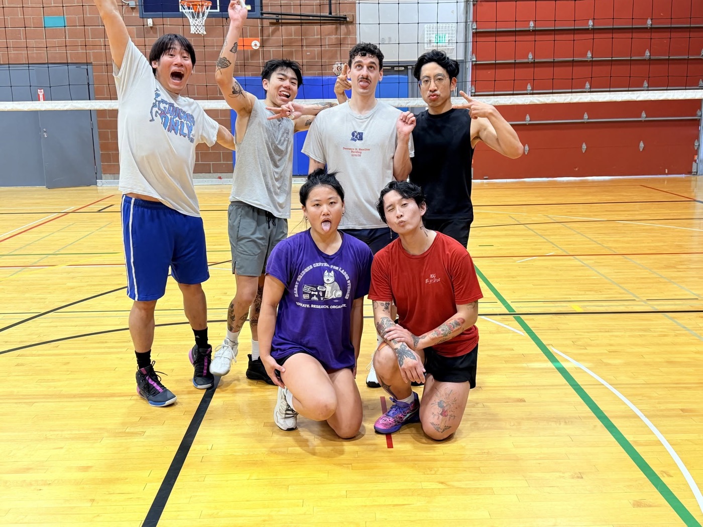
Unicorn Volleyball Club
Indoor 6s · Fall 2026 · Sundays, Seattle
Tournaments
Nothing coming up.
F. Night
Partiful's move: near-black, a blurred glow of warm colour bleeding in from the top, thin rules, pill buttons, a plain grotesque. Ours glows coral and gold, not violet. Rows with a small photo, like a guest list. This is the one that says "the app for a night out" and it suits pick-up.
Pick-up
Nothing coming up.
Leagues
Unicorn Volleyball Club
Indoor 6s · Sundays · Seattle
Tournaments
Nothing coming up.
Put on a game
G. Tiles
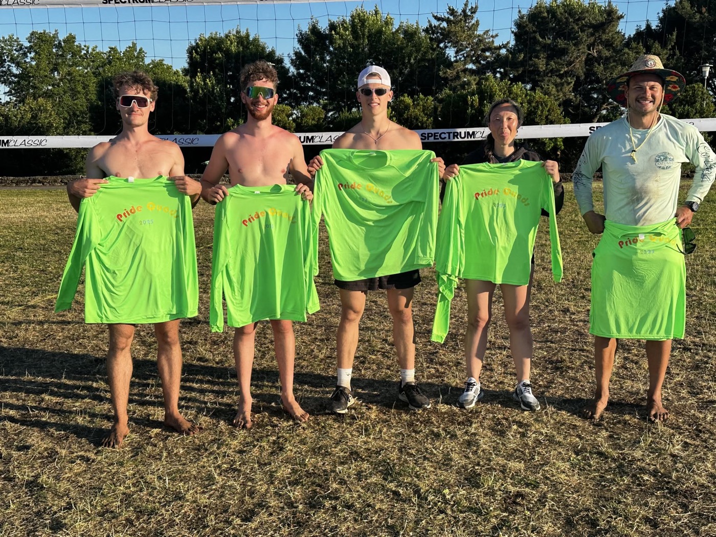
Apple's move: the page is a stack of full-width tiles, each with one centered headline, one line under it, and two pills. The photo tile is the product shot. It's the most "website" of the eight, and the easiest to grow: every new league is another tile.
H. Settings
Not a website at all: an iPhone screen, in the system's own grouped-list idiom. Big title, white inset groups, 17px text, chevrons, grey footers in sentence case. It looks like something installed, not something generated, because the idiom is Apple's and everyone has it in their pocket.
Pick-up
Nothing coming up
Games your friends put on show here.
Leagues
Tournaments
Nothing coming up